
As noted in my last post, I’m currently serving as the organizer for the postgraduate reading group associated with the Centre for Childhood Cultures at QMUL. Our reading group has a research blog, and I’m cross-posting a few of my CCC blog posts here. To see this post (and posts by other members of the group) on the CCC blog, click here. This time I’ve written about fonts in picture books! Enjoy!
*****
According to scholar Jenny Uglow, illustrations have been part of children’s publications since the early eighteenth-century due to ideas about children’s education – and, in particular, John Locke’s views of children’s education. Locke believed that children needed pictures of things in order to both entertain and educate them – what good is learning the word ‘lion,’ for example, without any idea of how a lion might look?

And Tango Makes Three by Justin Richardson and Peter Parnell, illustrated by Henry Cole
Locke’s ideas of illustrating children’s books for practical educative purposes has certainly stood the test of time, yet contemporary picture books attempt to do more than simply educate children on how the world looks. Now, picture books can be used as tools to help children process feelings and ideas. In our recent Centre for Childhood Cultures reading group, we read three picture books dealing with large or difficult topics: The Red Tree written and illustrated by Shaun Tan, The Dead Bird by Margaret Wise Brown with illustrations by Christian Robinson, and And Tango Makes Three by Justin Richardson and Peter Parnell with illustrations by Henry Cole.
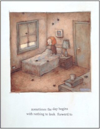
Image from The Red Tree by Shaun Tan
While these three books deal with vastly different topics in vastly different tones, something that struck me while experiencing these three books was the way that the printed text functioned as an extension of the mood or tone of the book. For The Red Tree, a picture book that deals with depression or perhaps grief, the text was slightly off-kilter – certain letters sat a bit higher than others, like a broken typewriter. Occasionally letters grew larger as words became more important. In And Tango Makes Three, a heart-warming book about a non-traditional penguin family, the written text was in a joyful, curly font that resembled a child’s handwriting. In The Dead Bird, the text was a straight sans serif font – it seemed to not want to call attention to itself, almost blending into the illustrations. Like the words of themselves, the physical text of The Dead Bird was unadorned.
I began to consider how the written text – by which I mean the font and text placement itself – becomes an extension of the illustrations in children’s books. It seems somehow akin to concrete poems, or, poems in which the arrangement of the words on the page convey meaning more than the words themselves – for example, a poem in which words are arranged as drops of rain, or in which curl words in on themselves in a spiral.
Who chooses how to typeset the text in a children’s picture book? Who decides on and designs the font? If the writer and illustrator are two separate people, how do they collaborate on the design of the font? And who is the font for? If a pre-literate child looks at the page, does the font or the placement of the words register? How does the look of the written text inform an adult’s experience of the book when reading to a child? Uglow writes, ‘however closely writer and artist work together, their work can never ‘mean’ the same, because meaning is bound up with the writers’ system of alphabetic symbols and words, and the artists’ lines, shading and colours’ (140). Yet, when text becomes art, can meaning begin to cross the boundaries between the verbal and the illustrative?
About the author: Abigail Fine is a third year PhD student at QMUL. Her research focuses on Cinderella adaptations in the twentieth and twenty-first centuries, with an emphasis on Young Adult and Middle Grade adaptations.
References and Further Reading
Aube, Christina and Nancy Perloff. ‘What is Concrete Poetry?’ Getty Iris Blog (blog). March 23, 2017. https://blogs.getty.edu/iris/what-is-concrete-poetry/
Uglow, Jenny. Words & Pictures: Writers, Artists and a Peculiarly British Tradition. London: Faber and Faber, 2008
Villarreal, Alicia, Sylvia Minton, and Miriam Martinez. ‘Child Illustrators: Making Meaning Through Visual Art in Picture Books.’ The Reading Teacher. November/December 2015. Vol 69, No. 3., p 265-275.